:format(webp)/cdn.vox-cdn.com/uploads/chorus_image/image/50579917/richard_sapper_ibm_thinkpad_header.0.0.jpg)
Search the word "futuristic" on Curbed and, even without images, a certain look emerges. "Not a right angle in sight." "Swoopy." "Jetsons." When the pictures load, there’s an overwhelming whiteness to go with the curves and the assisted floatation, windows like aerodynamic diagrams, columns like Tulip chairs, highlights like an early-2000s logo redesign. It’s a future that owes a lot to Buckminster Fuller and Zaha Hadid, and a little to childhoods spent at Epcot, but is now synonymous with Apple, via the radius corners and metallic sheen of products great and small.
Apple, under the meticulous design direction of Jonathan Ive, continues to dominate the collective imagination with a singular vision the tech’s future. The pinched end of my MacBook gives the visual illusion of levitating. My Apple monitor floats on its bent-aluminum stand. The corners of my overlarge iPhone draw no blood. Their collective uncolor stands in contrast to everything else in my house, and their material imparts a subtle sense of luxury. Thorstein Veblen wrote, over a century ago, about the handmade silver spoon, free of decoration, as a symbol of "inconspicuous consumption." The iPhone, as a luxury that seems to be everywhere, partakes of the same soothing, shiny uniformity. Only the maker knows what’s under the hood.
:format(webp):no_upscale()/cdn.vox-cdn.com/uploads/chorus_asset/file/7015533/Richard-Sapper-Jonathan-Olivares-spread.0.jpg)
Contrast that with the ThinkPad T400—so many laptops ago—I just dug out of a drawer. I religiously recycle my electronics , but I couldn’t let this one go. It’s a museum piece. It is heavy, thick like an architecture monograph. I blow the dust off and its matte black surface is unmarred. I try to open it and I can’t: I’d forgotten the gesture, once second nature, of sliding my thumb across the catch. A tiny button catches on the soft pad of my thumb, and I press. It opens with a satisfying click.
The cover releases to reveal a black screen and black keyboard, each key subtly highlighted by its rightside bevel. In the center, a red dot: the remains of the joystick, the so-called TrackPoint nub. There’s also an On button. It’s nice to see that again. Where my MacBook is homogenous and smooth, the ThinkPad was tough and clicky. Richard Sapper, who designed the original ThinkPad with Kaz Yamasaki in 1992, didn’t put in all of these physical elements because he was a bad designer. This is what he thought the future looked like. So why don’t we?
I’m not the first to ask this question. In 2013, critic Justin McGuirk wrote, "In the 1970s and ’80s, the soul of product design was in the hands of two Germans. One was a minimalist who reduced products to seductive shells with their features rubbed smooth, and occasionally gave them nicknames like Snow White’s Coffin." That would be Dieter Rams. "The other, far from hiding the technical nature of these products, reveled in it." McGuirk saw Sapper as the Darth Vader to Rams’s Obi-Wan Kenobi.
:format(webp):no_upscale()/cdn.vox-cdn.com/uploads/chorus_asset/file/7013373/Richard-Sapper-Jonathan-Olivares-book-cover.0.jpg)
Rams’s work designing consumer products for Braun in the 1960s and 1970s is seen as the model for Ive at Apple, though the apprentice surpasses the master in public recognition. Since 2013, Apple’s tech style has only grown more ubiquitous and far-reaching, shrinking to fit the wrist and growing to subsume entire suburban blocks. The likely 2017 opening of Apple’s shining Cupertino donut—"not a right angle in sight" "swoopy" "perched" "Jetsons"—will be the apotheosis, perhaps the end of that particular future.
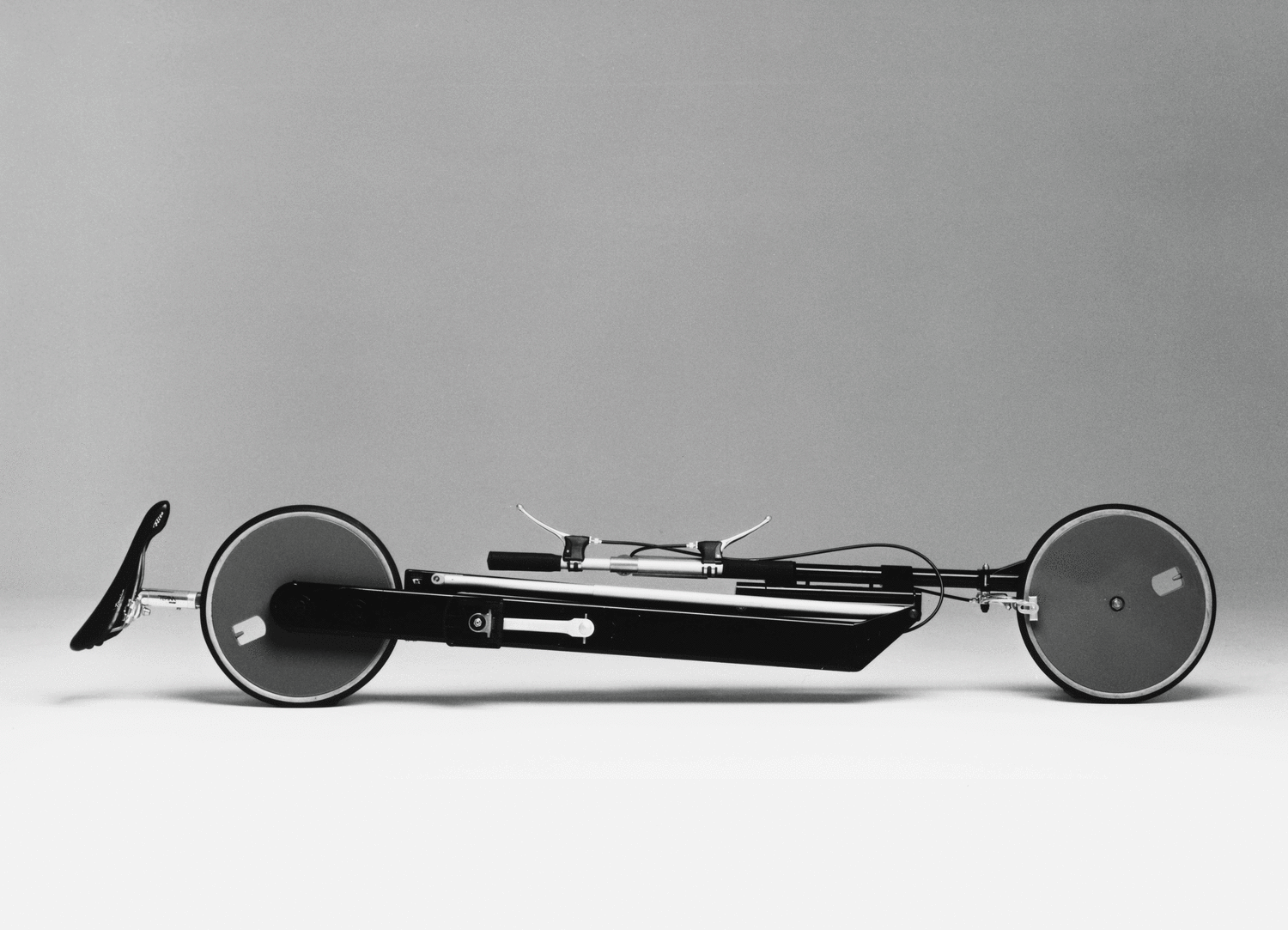
When Los Angeles-based designer Jonathan Olivares first met Richard Sapper in 2008 in Milan, Sapper’s adopted home, he put it more bluntly: Why black?
"I expected him to come back with a hardcore minimalist modernist objective," says Olivares who, like Sapper, has designed for Knoll. But Sapper said something different. "Black looks good in all kinds of interiors: old interiors, messy interiors, a clean modern interior. It ages really well. It doesn’t look dirty. You don’t see the seams. He told me, Next time, look at a white car and look at a black car. On a white car you see all the joints." Sapper told two different stories about the shape of the ThinkPad. One is that he was inspired by the cigar box, the other by the bento box. In either case, a deceptively dark, plain exterior opens to a world of flavor. The red nub is either a beautiful cigar wrapper or a nice piece of tuna. It’s such a practical explanation it takes a moment to sink in. It’s as if this product designer knew your life.
Their conversations have now been collected in a book, Phaidon's "Richard Sapper, Edited by Jonathan Olivares," which charts the course of Sapper’s diverse career in a package the size, shape, and layout of my ThinkPad.
:format(webp):no_upscale()/cdn.vox-cdn.com/uploads/chorus_asset/file/7013315/Tizio_Richard%20Sapper_Alessi.jpg)
Sapper and Olivares’s book begins with a series of photographs of Sapper’s homes by Ramak Fazel. They are not Instagram-ready. We see faded floral cushions on his own translucent Tosca stacking chairs (2007), spot his Tizio lamp (1972) in front of a wall of design books, his Alessi pots (1986) on a lazy Susan that’s in need of a fresh coat of paint. Sapper had a long career and, nota bene, not everything he made looks alike. "His physical environment wasn’t a temple," says Olivares. "They were messy, warm, humanistic spaces." His products were designed to get along with Oriental rugs, children’s toys, and tablecloths, not to banish everything that came before them. The past gave him ideas. "I was really keen on getting a photo of the chairs in his home," Olivares says. "He lifted the armrests from his grandfather’s wooden armchair and put them"—in plastic—"on the Sapper chair."
Although the Tizio and the ThinkPad, plus the Plico beverage trolley (1976) and the Nena folding armchair (1984) all do look alike, sharing a color, a rectitude, and a surprising acrobatics, he tried color on a set of stackable, toylike children’s chairs, still made by Kartell, an Art Deco profile on a coffeepot and teakettle in stainless steel. There’s the hamburger-like Grillo phone (1965, with Marco Zanuso) and a kitchen timer that does one thing so perfectly it could be a Rams design.
Sapper’s products were designed to get along with Oriental rugs, children’s toys, and tablecloths, not to banish everything that came before them.
Sapper lived with multitudes and made multitudes, and his idea of the future didn’t involve getting rid of everything past, whether personal or visual. Technology, in his world, could co-exist with sentiment and age. To the end, he was still trying to invent a lamp for people who couldn’t hardwire to the ceiling above their tables. It was based on a fishing rod. That was the kind of "perching" that was of interest to him.
As tech journalism often forgets, Jobs wasn’t the first to build a tech empire on design. IBM was. When Sapper arrived, IBM was in a state of disarray after the death, in 1977, of Eliot Noyes. Noyes, the company’s "curator of corporate character" from the late 1950s on, presided over the company’s graphics (led by Paul Rand) as well as products, art collecting, and architecture. While Noyes would drill down on specific new technologies, like the "golf ball" type element on the Selectric, as well as its curved form, he also took a broad view of trade dress. Noyes had the radical idea that everything didn’t need to look alike, as long as it had Rand’s Eye-Bee-M on it. The Selectric could look like a Henry Moore while the System 360, the company’s world-beating mainframe, could look like a city of Mies towers. Towers that revealed their workings through literal windows, circuits, and tubes picked out in colors like the ducts and wiring of a 1970s building. Laptops were too compressed to contain a window, but the red nub is a remnant of the same idea. Your hands should show you the way around the computer.
Meanwhile, Eero Saarinen could build the company a curved, low-lying black research center in Yorktown Heights, NY, while Noyes built them an upright, punchcard-façade aerospace center in LA. Architectural consistency mattered less to IBM than Architectural consistency mattered less to IBM than freshness of approach.. This approach was adapted from Olivetti, a technology company that owned several of the world’s most spectacular tech showrooms, all made of different, unmachined materials. Sapper knew this tradition well, given his seat in Milan and collaborations with Zanuso, who designed buildings for Olivetti. The two worked together, in 1964, on a toadstool-like mini computer for Olivetti, as well as boxy radios and TV sets for Brionvega.
Steve Jobs, too, knew all this. When he resigned from Apple in the mid-1980s and founded NeXT, Inc. he hired Rand to design the company logo, a black box with colorful letters inside it, in advance of the product. The workstation, designed by Frogdesign and nicknamed "the cube," was a black box. Jobs chose black—a color already integral to Sapper’s design approach, though he had yet to convince IBM to abandon beige—but he made it complicated, insisting on true right angles for the case (most manufactured corners are slightly eased) and an extra sanding to remove all marks from the manufacturing process.
Rather than working from the inside out, Jobs insisted that the inside and the outside conform to his vision. He was also resolute about the closed system that still frustrates many about Apple products. Not only did the NeXT have no window into its inner workings, part of what doomed the NeXT devices were their lack of compatibility, even with themselves.
:format(webp):no_upscale()/cdn.vox-cdn.com/uploads/chorus_asset/file/7017895/richard_sapper_products_2_brionvega_alessi.0.jpg)
Noyes, then Sapper’s, design approaches were so different from that of Apple, where everything must go with everything. If the ThinkPad were a building, it might be like Saarinen’s IBM Yorktown, though I prefer Craig Ellwood’s Arts Center building in Pasadena as a direct analogy: low and dark and sleek, with circulation on display and an unfussy relationship to its site. It’s solid and workmanlike, while also being dramatic and a little bit macho.
On the home front, Noyes’s own house in New Canaan seems like a reasonable analogue: it, too, is framed in dark steel and sits squarely on the ground, with hard edges and no floating. The fieldstone walls nod to the historic walls running through the Connecticut countryside. Noyes hacked his own version of the Tizio for the living room, embedding the Luxo lamps found in many a design office in blocks of concrete, the better to light the sofa. (Given time, he might also have experimented with fishing rods.)
His domestic environment, like Sapper’s, was filled with family furniture, modernist icons, and items of sentimental value. Noyes’s home, which was considered noteworthy enough to appear in LIFE magazine in 1963, seemed futuristic in its own time.
But it would probably not warrant such a spread today. For a recent lecture architect Fred Scharmen gave, he put together a list defining the qualities of yesteryear’s ideal "House of the Future." As he put it, "It’s like a meme before the fact." The Noyes House, as you might expect, scores poorly.
1. The House of the Future is always surrounded by cool vehicles (the more, the better)
2. The House of the Future always contains media gadgets (and is usually trying to sell them to you)
3. The House of the Future is usually suspended above the ground (for some reason)
4. The House of the Future is sub-urban (and has a hard time shaping public space)
5. The House of the Future is pre-fabricated, adaptable, and modular (but no one ever changes it)
6. The House of the Future is non-orthogonal (diagonal lines and radiused curves mean future)
7. The House of the Future is for the white heteronormative nuclear family of around 1960 (technology, materials, and aesthetics change fast, popular perception of "normal" changes slowly)
Present day "futuristic" homes and offices score much better. Media gadgets, check; floating, check; suburban, check; non-orthogonal, check. While the Apple ring seems like an implacably closed system, adaptability is a watchword of the Google headquarters designed by BIG and Heatherwick Studio. In their renderings, the "cool vehicles" are bicycles, and the giant underground parking garages pioneered by the IBM generation of corporate headquarters is nowhere in sight.
The black box wasn’t an end but a means, a simple frame or platform in which anything could happen. I’m not so sure our current "future" is family-friendly. The purge fantasies that dominate discussion now—Kondo-izing wardrobe, pantries, errands, even your gadgets—seem intended for the child-free, since dependents impact your ability to count (calories, minutes, steps, inboxes). "Futuristic" designs seem intended for one lifestyle only, after the experiment is over.
What I find appealing about a Sapper-influenced future is the sense that we wouldn’t have to be so careful not to break, to spill, to let sentiment intrude or go over our daily calories. That future can be made of almost anything, can stack neatly and doesn’t require custom furniture to fit its curves. We might not need to waste energy on stairs, elevators, and ziplines to get us to our clifftops like James Bond villains. We wouldn’t have to figure out how to open a closed pod without tactile or visual cues. We would not be living up to our future, it would be working for us.
Loading comments...