Every couple of weeks, I’ll round up and share the objects, designers, news, and events worth knowing about.
A Tool for Finding the City’s Public Art
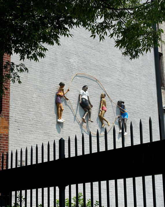
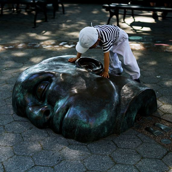
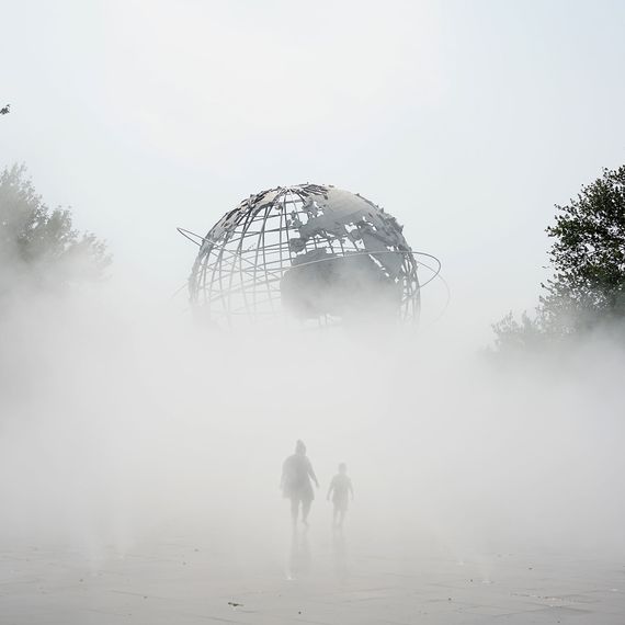
Robert Girardin, a location scout for film and television, moved to Yorkville from Los Angeles last year. He’s always appreciated the city’s public spaces and public art, but during the pandemic he experienced them anew. He decided to research and photograph as many sites as he could so that more people could easily discover artwork that’s often overlooked. The result is Materialism, an online map and database. So far, Girardin’s compiled 250 public art sites — including art commissioned for corporate plazas, sites in NYC’s Percent for Art program, classical and modern park monuments — and it’s growing each week. I, for one, didn’t realize the massive piers in Battery Park that I’ve sat in front of many times on lunch breaks were Martin Puryear sculptures. Building Materialism changed Girardin’s relationship to the city. In his words: “Visiting these sites was frustrating, like when I schelpped out to Far Rockaway only to find the piece covered in construction netting; calming when I sat on the shore of Roosevelt Island waiting for the sun to rise high enough to illuminate a Tom Otterness piece; surprising when I spotted the Joseph Kiselewski pieces on Parkchester Houses while riding the elevated 6 train; and even tedious since I had to revisit some midtown pieces five or six times before the unpredictable light in our urban canyons lent itself to the photo I needed. But above all, it’s great fun.” Tracking down the sites yourself might be, too.
Pages from Charlie Watts’s Brief Design Career
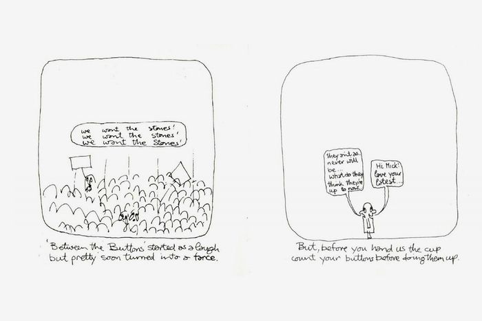
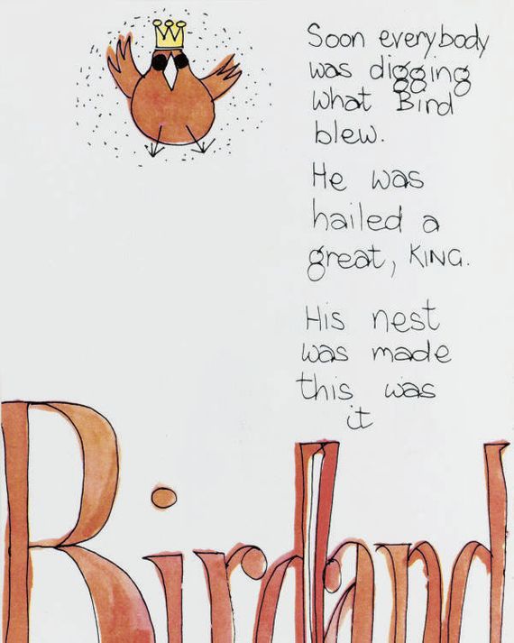
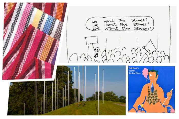
On August 24, the world mourned the passing of Charlie Watts, the Rolling Stones’ drummer (and best-dressed member). The design consultancy Pentagram shared a tribute that also revealed a little-known nugget about Watts’s life: He once aspired to be a graphic designer, and worked at Hobson, the London ad agency where Bob Gill, one of Pentagram’s co-founders, was an art director. I called up Gill, who’s 90, to see if he recalled anything about Watts’s design work. Turns out, it wasn’t anything memorable. “Charlie was not very skilled,” Gill says, bluntly yet affectionately. “He was doing ordinary paste-up in the agency’s bullpen.” (In the days before Adobe, layouts were cut and pasted by hand and the bullpen was the top floor, where that sort of mechanical work took place.) Gill and Watts became fast friends at Hobson. “Both of us were absolutely insane about jazz,” says Gill, who is also a pianist. Still, Watts wanted to become a great designer and for Gill to teach him how. Gill didn’t support that idea and told him: “You’re a great drummer, but you’re a dopey designer.” In 1962, Gill left Hobson to start his own agency, Fletcher/Forbes/Gill. That same year, the Rolling Stones formed, with Watts on drums. Still, Watts couldn’t shake the urge to design. In 1964, he wrote and illustrated a children’s book about the jazz saxophonist Charlie Parker called Ode to a High-Flying Bird, a sweet story filled with his doodles. Watts also illustrated a comic strip that accompanied the Stones’ 1966 U.S. tour program that featured Mick Jagger on a stage that got progressively higher as a crowd hurled insults at him like, “He’s very good … if only he’d cut his hair” and “He doesn’t wash.” While they’re both endearing efforts, I’m glad Watts dropped his design ambitions for a set of drumsticks.
A Reflection on Christopher Columbus at Exhibit Columbus


Every year, the town of Columbus, Indiana — known for its impressive collection of modernist architecture, including buildings by Eero Saarinen, Harry Weese, I.M. Pei, and Robert Venturi — becomes a huge outdoor art-and-design exhibition. The 2021 edition opened at the end of August, and this year the focus is on deepening our understanding of the history and future of cities. I haven’t visited the exhibition in person, but one of the works that feels especially evocative is Columbus Columbia Colombo Colón, an installation by Dream the Combine. It’s composed of 58 steel poles in Mill Race Park and meditates on different cities in North America named after Christopher Columbus. Jennifer Newsom and Tom Carruthers, the studio’s founders, researched the histories of these cities and towns and etched them into the metal poles, which all together look a little bit like Walter de Maria’s 1977 land art sculpture Lightning Field. The one representing Columbus, New York, tells a story about a tree in the area that symbolized a peace treaty between the Oneida, Mohawk, Seneca, Onondaga, and Cayuga, while the marker for Columbus, Georgia, mentions the work of the enslaved architect and builder Horace King — significant and unique histories that are flattened by their town names. After a year of statue removals and protests that often centered on emblems of Christopher Columbus, this work shows how the evidence of colonial history persists beyond monuments, and how their removal doesn’t repair all those harms. Through November 28.
Pixelated Place Mats and Table Runners Made by Students in Kentucky
These very beautiful striped table linens also have a cool backstory: They were designed and handwoven by students at Berea College, a tuition-free Kentucky school. One of its work-study programs focuses on crafts — ceramics, woodworking, and weaving — and in 2018, the designer Stephen Burks worked with the students to develop a line of cotton table linens that are now available at Design Within Reach. The place mats ($140 for four) and runners (from $215) are all slightly different, owing to customization by the students who made them.
Push Pin Studios at Poster House
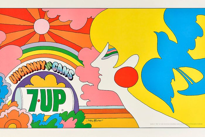
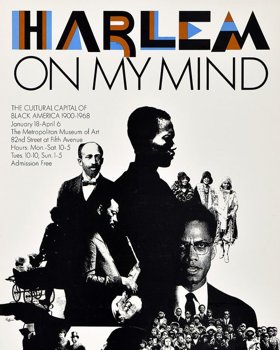
When modernist graphic designers were obsessed with perfect typography and ideal proportions, Push Pin Studios — the inimitable studio founded by Milton Glaser, Seymour Chwast, Edward Sorel, and Reynold Ruffins in 1954 — was more concerned with entertaining and having fun. They made ads and posters that were playful and visually exciting and never followed any rules. You’d find Day-Glo colors mixed with a classical illustration (like that Bob Dylan poster) or drawings meant to look like a crumbling mosaic (like a PBS series promo for its Masterpiece Theatre series of I, Claudius). It was a sensibility over a style, and it still feels exciting today — especially considering so much graphic design now has adopted a very homogenous (and safe) Instagram aesthetic. This week I learned that part of this magic came from browsing files in the New York Public Library’s Picture Collection, which is at risk of closing to the public. An exhibition that shows the tremendous breadth of this studio’s work is on view at Poster House through February 6, 2022.


