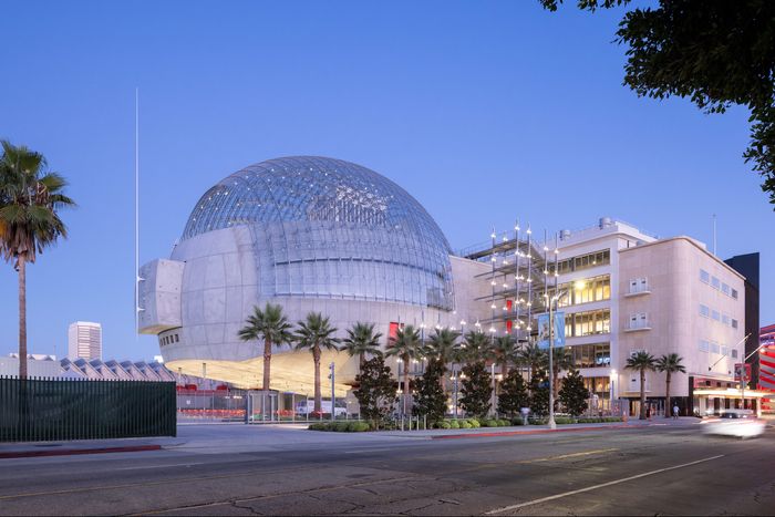
It’s a ball! It’s a globe! (But please, please don’t call it the Death Star.) It’s the Academy Museum of Motion Pictures, which opened last week in Los Angeles. Designed by Renzo Piano, this museum of film has been decades in the works, and in addition to having a scene-stealing sphere, the campus plays many roles, from reclaiming a stunning Streamline Moderne department store to anchoring a new transit-adjacent cultural corridor. Curbed critics Alissa Walker and Justin Davidson had a coast-to-coast conversation about how to design a museum for moving images, the legacy of orb architecture, and how a glass dome situates itself on one of L.A.’s most quickly changing streets.
Justin Davidson: Thanks for reporting from Starship La Brea, Alissa. Can you describe where you are right now?
Alissa Walker: My mission, as I understand it, was to infiltrate the five-story orb that has been seen rising above the Miracle Mile district for several years. And I have to say, Justin, I’ve already failed. The glass-domed terrace atop the brand-new Academy Museum of Motion Pictures was closed for the setting up or breaking down of some private event, and that level is apparently not going to be open to the public with any regularity, which was a huge disappointment.
J.D.: So what, exactly, is a big glass globe doing at the corner of Wilshire and Fairfax, and is it a good idea?
A.W.: Well, the architect, Renzo Piano, would prefer that you call it “the bubble.” He’s not pleased with the fact that people have already basically renamed it in honor of Darth Vader. We already have a bunch of buildings we’ve nicknamed the Death Star, and most of them are by Thom Mayne, but this one really does look like one. And I guess I’m not entirely sure why this museum of film needed this globe appendage at all: There’s a theater inside it, and I was expecting that space to be orblike, perhaps with a curved Cinerama screen. But it’s just a very nice, standard theater. And one that you’ll need to purchase an additional ticket for to get inside.
J.D.: As we’ve watched it come together, we’ve been thinking about the history of globular architecture, which is plentiful. It has its origins in the 18th century, with Boullée’s cenotaph, but recently glass-and-metal giant marbles have been popping up around the world: at the science museum in Nagoya, Japan, in Paris (which even had a recent exhibition on the topic), and of course at the Rose Center at the American Museum of Natural History.
A.W.: Don’t forget the bubble skyscraper just proposed for Hollywood by MAD Architects. It’s not a perfect sphere, but it does have some similar qualities, including a glass-and-steel domed observation deck on top.
J.D.: What do you think Piano’s soccer ball adds to that already well-rounded discourse?
A.W.: This has been under construction for a long time, and I’ve already gotten used to how it’s dropped into the landscape. Unlike, say, what happened with Disney Concert Hall, which really did reorient Grand Avenue, the same thing isn’t happening for me with the Academy Museum. When you buy the T-shirt of L.A.’s most famous design landmarks, is this ball on it? I don’t see it destined to become some iconic architectural symbol of L.A.
J.D.: In the sense that it doesn’t reshape the context that every other architect designing nearby will have to respond to?
A.W.: Right, it’s not agenda-setting architecture, and it’s not idiosyncratic enough to capture the imagination the way the Capitol Records building does, for example.
J.D.: Piano presents himself as a hyperrational architect with an overlay of sincere emotiveness, and of course the sphere is traditionally the perfect form, although it’s difficult to build or inhabit. Does he make a case for why that shape is necessary here? I mean, it’s a museum of movies, for heaven’s sake — not a monument to the gods of statistics or something.
A.W.: Exactly, and in the aerial shots — Iwan Baan took some really gorgeous ones — you can maybe see what Piano is trying to do, creating this delicate soap bubble rising on the urban landscape, as he told the Los Angeles Times critic Carolina Miranda. And it does create a nice “what’s that?” moment if you’re, say, hiking in Runyon Canyon. But when you’re up close, the experience is definitely not “soap bubble.” It’s oppressive. The glass is only on the top, and the side of it facing away from the museum reminds me of a circuit-breaker box in someone’s basement. Everywhere it touches the ground — including these giant base isolators to keep it from rolling away in an earthquake — is concrete. Walking underneath it is almost claustrophobic, like being in the cramped lower floors of a parking garage. It’s uncomfortable.
J.D.: Yeah, when I read that, my b.s. meter started trembling like crazy. I remember when he designed the New York Times tower on Eighth Avenue, he talked about it “dematerializing” at the top, where the ceramic rods extend past the parapet. That’s a favorite archi-word, and it just flies in the face of people’s experience. A big glass-and-steel ball is not vanishing into the mist. It sits there and it’s shiny and hard and you have to pay to get in. Doesn’t it also defy the whole point of a museum of movies, which is to take this vaporous art and give it substance and permanence?
A.W.: What I would have rather seen — and this is maybe even more of a desire post-pandemic — is some architectural interpretation of a movie screen. Inspired by a drive-in theater, maybe, but a walk- or roll-in theater with the ability to project films ten stories tall, to make it seem like the whole city can have these viewing experiences together and host huge screening events or broadcast important world events or simulcast the Oscars. I am just not sure this sphere here — enclosed, elevated, and apparently mostly off-limits to the public — is up to the job.
J.D.: Speaking of which, let’s get beyond the shape and talk about how the architecture relates to the city and the immediate neighborhood and how people will relate to it. For non-Angelenos, we should situate it in the city. It’s at an amazing intersection, with the May Company Building, restored and incorporated into the museum, on one corner. The Petersen Automotive Museum, designed by Kohn Pedersen Fox — which, as you recently pointed out, gives some glam to the apocalyptic earthquake at the beginning of the new TV show La Brea — is right across the street.
A.W.: Shards of the Petersen’s facade tumbling into the sinkhole! It was glorious. Oh God, is the Academy Museum’s ball going to make me like the Petersen in comparison?
J.D.: Maybe! And Johnie’s Coffee Shop, an icon of Googie architecture, where some incredibly famous cinematic conversations have been conducted, occupies the third corner. So it’s a spot that people are used to slowing down for or even experiencing on foot. Especially because LACMA is down the block, and that’s a Renzo Piano campus that is morphing into a Peter Zumthor–designed blob vaulting across Wilshire. Does the new Piano tie all that together or create more chaos?
A.W.: First of all, this whole block is still a work in progress. Just down the street, the New York firm Weiss/Manfredi is designing an expansion of the La Brea Tar Pits and Page Museum. And of course, the LACMA teardown is well under way (unfortunately), so there’s constant construction. Having said all that, I’m a little disappointed with how the Academy Museum interfaces with LACMA’s campus, which is an interesting problem since Piano designed both of them.
J.D.: How so?
A.W.: What LACMA created — and this was all through Piano’s addition that nudged the campus west toward Fairfax — was this permeable campus that allows people to cut through from Wilshire to 6th Street. It has a soaring, covered plaza (where I’m actually sitting right now), places to eat and drink, lots of grass, and, of course, Urban Light, the Chris Burden field-of-lampposts sculpture that has become a huge L.A. destination. It created a quasi-public space. Between LACMA and the Academy Museum, though, there’s none of that interaction with the surrounding neighborhood. It’s all gated, although this may be temporary for the opening or construction-related because the whole campus is filled with trailers. But on the whole, the exterior spaces immediately around the Academy Museum are just not as vibrant because being anywhere near the bubble at ground level is just flat-out depressing, although I guess there is shade.
J.D.: So maybe Piano felt he had already shaped the campus and he didn’t need to add more not-really-public space. How does he deal with the May Building?
A.W.: Oh, that is something to be excited about. This was a department store designed by A.C. Martin and Associates, right after L.A.’s City Hall. It’s been one of those Streamline Moderne stunners that used to be plentiful along Wilshire that you just wished would be brought back to life.
J.D.: You’ve got to love that glittering cylinder that seems ready to shoot into space.
A.W.: Who needs a glass bowling ball when you have a gold-plated soup can? So LACMA owned it for a long time and used it as office space and would sometimes do small shows inside, and there was briefly a thought of putting the Metro Purple Line station — which we’ll get to in a minute — inside the building. The way that building has been adapted now is really remarkable. There’s not much 1930s detail left inside, but you can go to this little alcove on the second floor and see some historic photos. What’s really so great, though, is there’s a restaurant, Fanny’s, on the ground floor facing the street, so as you’re walking by you get these little Edward Hopper vignettes of people dining behind the curved-glass windows. Finally, this corner is back.
J.D.: Okay, so how well does the whole thing work as a museum? Piano has been the Savile Row tailor of American museums for decades now, the guy who could make a high-quality, conservative piece of fine architecture to an institution’s specifications and leave everyone satisfied and able to move and breathe. But not all his museums work equally well.
A.W.: The museum itself is really exceptional. The exhibit design, by the local firm Why, is just phenomenal, with these resonant, deep-hued rooms that feel edgeless — you step into them and feel completely immersed, as if you’re inside a movie screen. And there’s plenty of space to play with here: There’s a scenic painting of Mount Rushmore from North by Northwest that you can view on two different levels, which was one of my favorite exhibits. The galleries actually feel quite similar to the ones Piano designed for LACMA’s Broad Contemporary Art Museum next door, these stacked planes that aren’t too sprawling, with the same kind of busy zigzag of elevators and escalators and staircases between the floors. Those galleries have been praised for welcoming in natural light, while these excel at creating pitch darkness.
J.D.: From your description and the photos I’ve seen, it looks as though Piano has deployed his signature arsenal of gestures signifying refined but tough architecture. Ceilings crisscrossed by exposed ducts. Concrete floors. Cinematic strokes of crimson. Lots of staircases and glass walls. Do they feel generically Pianistic, or do they serve a specific purpose here?
A.W.: Pianistic is a good term.
J.D.: Well, I’m a music critic, too.
A.W.: I would say the fortissimo — ha — gesture is that he painted even the base isolators red. That’s one step beyond his usual move of painting the ducts, which are, as you said, giant and exposed and prominent both here and at LACMA. He’s now drawing attention to these massive springs, this seismic infrastructural necessity, which I guess is very “Renzo goes California.”
J.D.: He’s always liked showcasing the engineering and structural components. At the Whitney, it seems to tie into his ideas about art being analogous to an industrial product and the museum as factory. Which never really seemed like a very cogent argument to me but has become a cliché. But I can see why that would work at the Academy Museum. L.A. — well, Burbank and Culver City — is full of visitable back lots where the attraction is a glimpse behind the scenes at how the illusion of film is created. Also, the move does reassure visitors that the building maybe won’t vanish into that giant sinkhole.
A.W.: You also hit upon something which I think is pretty important. This museum about Hollywood isn’t in Hollywood, although you can see the sign very nicely framed in all the north-facing windows.
J.D.: What’s the significance of that?
A.W.: Instead of being alongside the very touristy destinations like the Walk of Fame, it’s part of this revived cultural district on Wilshire, which has an important new role to play, particularly as the new Purple Line station opens here in 2023. We’re going to have this reinvigorated linear downtown, making it much easier to live and work along this corridor and get very quickly to either side of the city.
J.D.: I’m looking forward to the day when you can take the subway to the beating heart of American car culture — not just the Petersen but Wilshire itself.
A.W.: That’s really it, right? Wilshire was the quintessential driving street, designed for cars in the 1920s, with architecture specifically created to attract people whizzing by at, what, 30 miles per hour back then?
J.D.: It’s slower than that now, most of the time.
A.W.: So maybe this big gleaming ball does situate itself somehow into Wilshire’s history.
J.D.: Partly because it feels quite retro, no?
A.W.: Like the Brown Derby.
J.D.: Right. Like a throwback to these big, billboardlike gestures of the 20th century, from the Hollywood sign to Frank Gehry’s Binoculars Building —actually the Chiat/Day Building, now owned by Google — in Venice. Not to mention the original Big Duck on Long Island.
A.W.: Someone once said it was supposed to look like a camera part or something, and Piano has clearly not embraced that explanation.
J.D.: There is one detail that really seems to come out of a movie: the aerial dogfights between hawk and pigeons. Can you explain that one?
A.W.: I saw only drones hovering today, but if you do see a bird of prey soaring above the museum, it is not moviemaking magic but a too-strange-to-be-made-up detail of glass-dome maintenance: To keep pigeons from shitting all over Piano’s work, there is apparently a hired hawk to scare them away.
J.D.: Was that part of the original plan, or is this the avian equivalent of duct tape?
A.W.: I’m curious about that, because in a lot of other buildings here — I’m thinking of the Broad in downtown, by Diller Scofidio + Renfro — they’ve made all the apertures too steep for pigeons to roost. I would love to see for myself how this all works here, but until I actually get into the domed terrace up top, I have no idea. I’ll have to cross that Barbra Streisand Bridge — and it really is named that — when I come to it.
J.D.: Just be ready to duck.


