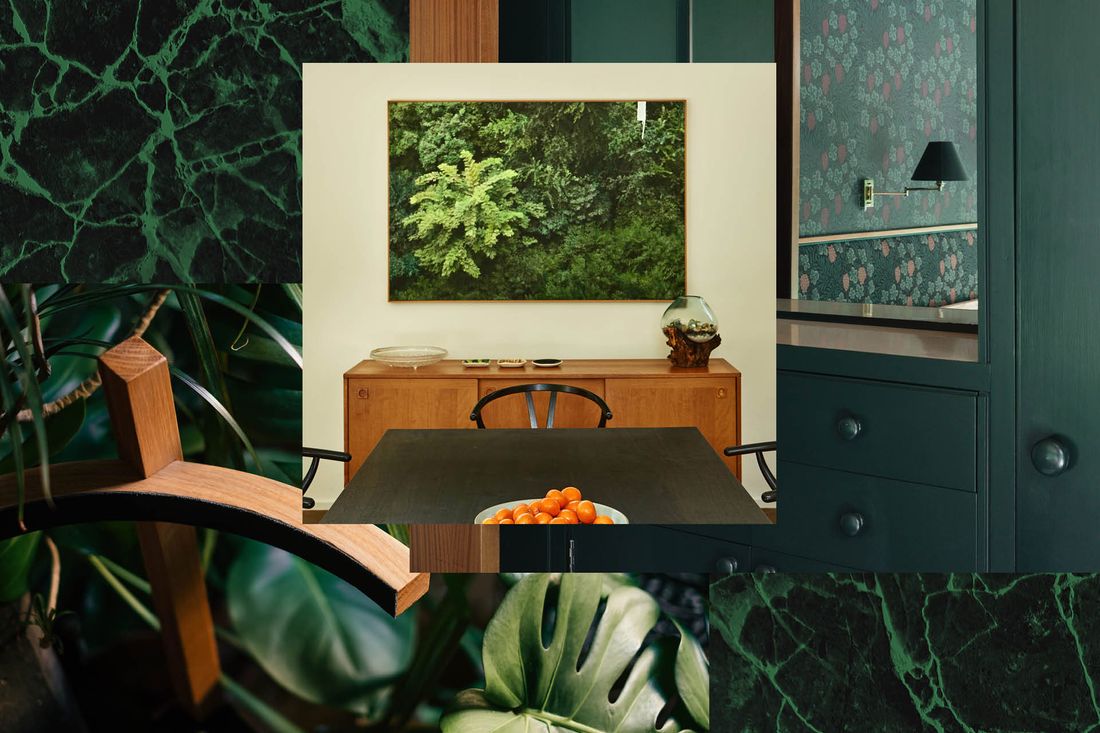
It started with the houseplants. Deep shades of green began to fill my Instagram and Pinterest feeds via fiddle-leaf figs and artfully placed monstera leaves. Soon the plants had backdrops in the form of tropical wallpapers. It’s been a gradual build, but today, we seem to be reaching full saturation of emerald green in home decor.
Six months ago, I witnessed the current appetite for emerald green firsthand when I wrote a feature on blogger Jordan Ferney’s San Francisco home for Parents magazine (where I am the lifestyle director). Her sons’ bold green room was the star of the story. Decked out nearly floor to ceiling in shades of green, this room made a statement — we liked it so much, we used the color scheme for her cover shoot as well.
The Pantone Institute named Emerald 17-5641 its color of the year back in 2013, but Leatrice Eiseman, a color consultant and executive director of the Pantone Color Institute, says that it’s common for colors to be a slow burn when it comes to the home. “When we named emerald color of the year, we saw it immediately in fashion — in shoes, in dresses — but for the home, it took more time.” Eiseman says that when a color begins to trend, consumers won’t run right out to buy, say, emerald green chairs, but they’ll maybe buy pillows with the color in the pattern. Gradually, the hue gets implanted in their minds. “When people see a color online and in catalogs, their eye becomes used to it, and then they’re ready to take the plunge,” says Eiseman.
After pillows often come sofas. Over the past few years it seems like every influential blogger and Instagrammer has swapped out the beige, caramel, and navy sofas of yore for bright, bold green ones. In addition to Ferney’s, I’ve spotted green couches in the homes of designer Shavonda Gardner, Joy Cho of Oh Joy!, Whitney Utesch, and others. Blogger and designer Justina Blakeney included a green sofa in her upholstered furniture collection for Living Spaces and says it was the collection’s best-selling color.
The popularity of a green Blakeney-designed sofa is not surprising: Blakeney’s brand, the Jungalow, is practically synonymous with rich, green, jungle-inspired hues. “It’s no secret how I feel about plants,” laughs Blakeney. “I see green as nature’s neutral, and because I like to emulate the beauty of nature in my work, green is a huge part of my design.” Blakeney argues that even bold emerald is actually as versatile as a no-color hue. “Think about the way plants look in a space,” says Blakeney. “I have never brought a plant into a room and thought, ‘Oh, this clashes.’”
Green’s association with nature also has a powerful impact on the feeling of a room. “Green gives you a sense of soothing, and it’s very refreshing,” says Blakeney. Sue Wadden, director of color marketing for Sherwin-Williams, says that soothing feeling comes from a sense of escape. “Our lives are so crazy, so frenetic today, that we desire to get into the forest, outside of technology — green gives us that feeling.” By painting a room green, you bring nature into your home, and according to Blakeney, emerald is particularly calming because it has lots of blue undertones in it. Blue has been shown to have calming properties in a number of studies, including one study of 2,000 people in the U.K. that found people slept best in a blue room and anecdotal evidence from Japan that blue streetlights may reduce crime and even prevent suicide. In addition to grass, trees, and leaves, emerald green is also associated with foods we think of as healthy, like leafy greens and vegetables — and more recently trendy green juices and smoothies.
Green houseplants offer more than just an aura of health: They actually deliver health benefits. Eiseman points to a much-cited study from Rutgers that showed that people began to breathe more deeply when exposed to living plants and flowers. Blakeney mentions a study conducted by the Department of Horticulture, Forestry and Recreation Resources at Kansas State University in 2009 that showed that patients recovering in a hospital room with plants recovered faster than those without. Plus, if you introduce green to your home through houseplants, they will actually help clean the air.
Eiseman suspects that emerald and other green colors have risen in popularity as more consumers want to be more “green” in their lives. “Environmental ideas of ‘green’ have been elevated,” she says. “Today, when you’re a company and you call yourself ‘green,’ that is the best thing you can say. Green hues have benefited from that.” Hippie sentiments may also play into green’s revival: The 1970s are back in a big way in home decor. “I’m personally inspired by the ’70s, and I am seeing jewel tones, plants, cane, rattan, and nods to tropical decor everywhere,” says Blakeney. The recent profusion of tropical and botanical wall coverings (Blakeney designs some) are another example of the ’70s revival that happens to feature a healthy dose of emerald green.
Emerald and other bold greens are not just being used by West Coast designers with laid-back vibes like Blakeney. Back in 2017, events and interior designer Ken Fulk stole the show at the annual Kips Bay Decorator Show House with his emerald green fantasia of a dining room. The February issue of House Beautiful featured a photo of a deep green room designed by New York City-based decorator Nick Olsen. Decorator Mary MacDonald’s emerald-adjacent teal library designed for Jeremy Johnson, founder of Too Faced Cosmetics, appeared in the March issue of Elle Decor. (Green has seen a resurgence in restaurant decor, too.)
Olsen has long been fond of the color. “Emerald green is a very luxe color. And it’s more versatile than it gets credit for,” he says, echoing Blakeney’s sentiment that green can act as a neutral. Considered a jewel tone, emerald green, Olsen notes, has long had connotations of luxury. “Historically, emerald green is silk, damask, a brocade, or a heavy velvet,” says Olsen. “But today it can be a beautiful Belgian linen or the leaf color in a block printed floral — it doesn’t have to be this decadent silk dripping in fringe.”
While green has an aura of wealth and the homes in House Beautiful and Elle Decor typically belong to the very well-to-do, deep paint colors, including emerald, are trending across economic brackets. These days you’re just as likely to see a bold room on your Instagram feed or on a blog as you are in a high-end decor magazine. That is in part because deep color is easier to achieve. According to Wadden, the quality of richly pigmented paints has improved in recent decades, and these paints are much easier for the everyday person to apply. It’s also easier to imagine in your own home if you see it in someone like Jordan Ferney’s two-bedroom San Francisco apartment than if you see it in a millionaire’s luxurious estate.
Olsen also says that he’s heard green called the color of genius — and there’s actually some science to back up that idea. A 2012 study in the journal Personality and Social Psychology Bulletin had subjects glimpse green before a creative task; when they did, their performance improved. Another study, published in the journal Thinking Skills and Creativity in 2016, showed that business students who completed a task on green paper demonstrated increased visual creativity.
Wadden believes color trends reappear every 20 to 30 years, so emerald green is right on time for a revival. In the 1990s, Wadden says emerald green was often used in combination with burgundy, and it could be found on walls, carpets, granite countertops, kitchen cabinets, and upholstery.
Today, emerald green is paired with a different set of colors and materials. It is sometimes seen in combination with the white and natural tones of sisal, rattan, and wood. Olsen, Blakeney, and Wadden all also note that emerald green is often used in combination with other adjacent greens (sage, spearmint, and forest green) and cool tones for a tonal yet mostly monochromatic look. Another palette to emerge: “Terra cotta and emerald green — now, that pairing is having a moment,” says Blakeney, who jokes that this combo will take over from the plants-on-pink Instagram trend.
Wadden agrees. “I’m seeing emerald green with cosmetic tones,” she says, “like soft pinks, soft peaches. It looks a little retro-inspired, but because the undertones of emerald have a blue cast, it feels reinterpreted.” She also notes that emerald looks beautiful with two other trendy hues: copper and rose gold.
If you’re thinking of trying emerald green in your own home, start with a houseplant and see where it takes you. Just be careful not to pair it with a classic red: This particular combo, the designers I spoke to agree, almost always reads as Christmas.
Laura Fenton is a writer based in New York City. Her work has been published in Better Homes & Gardens, Country Living, New York magazine, and Parents, where she is the lifestyle director.
Sign up for the newsletter


